Pinnacle Bank
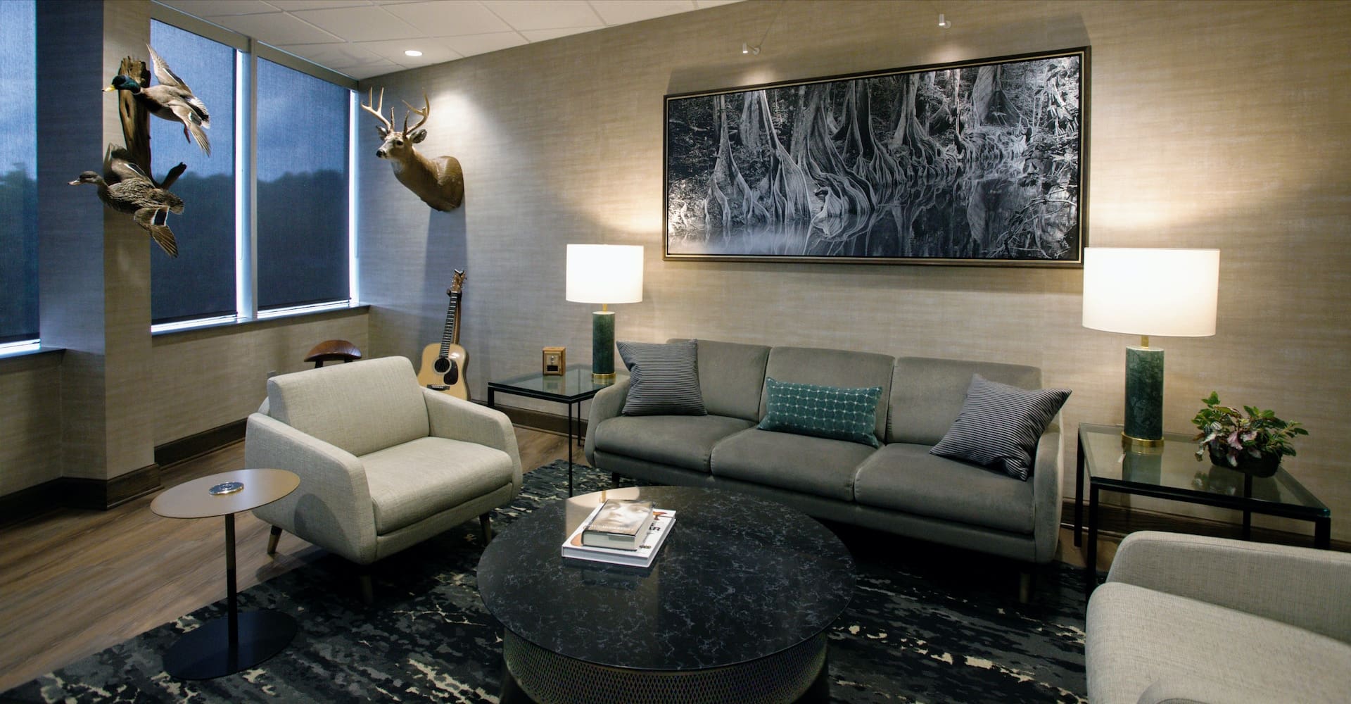
We created an updated, distinguished look defining Pinnacle Bank’s identity, highlighting their history, and demonstrating they were “here to stay” and poised for the future.
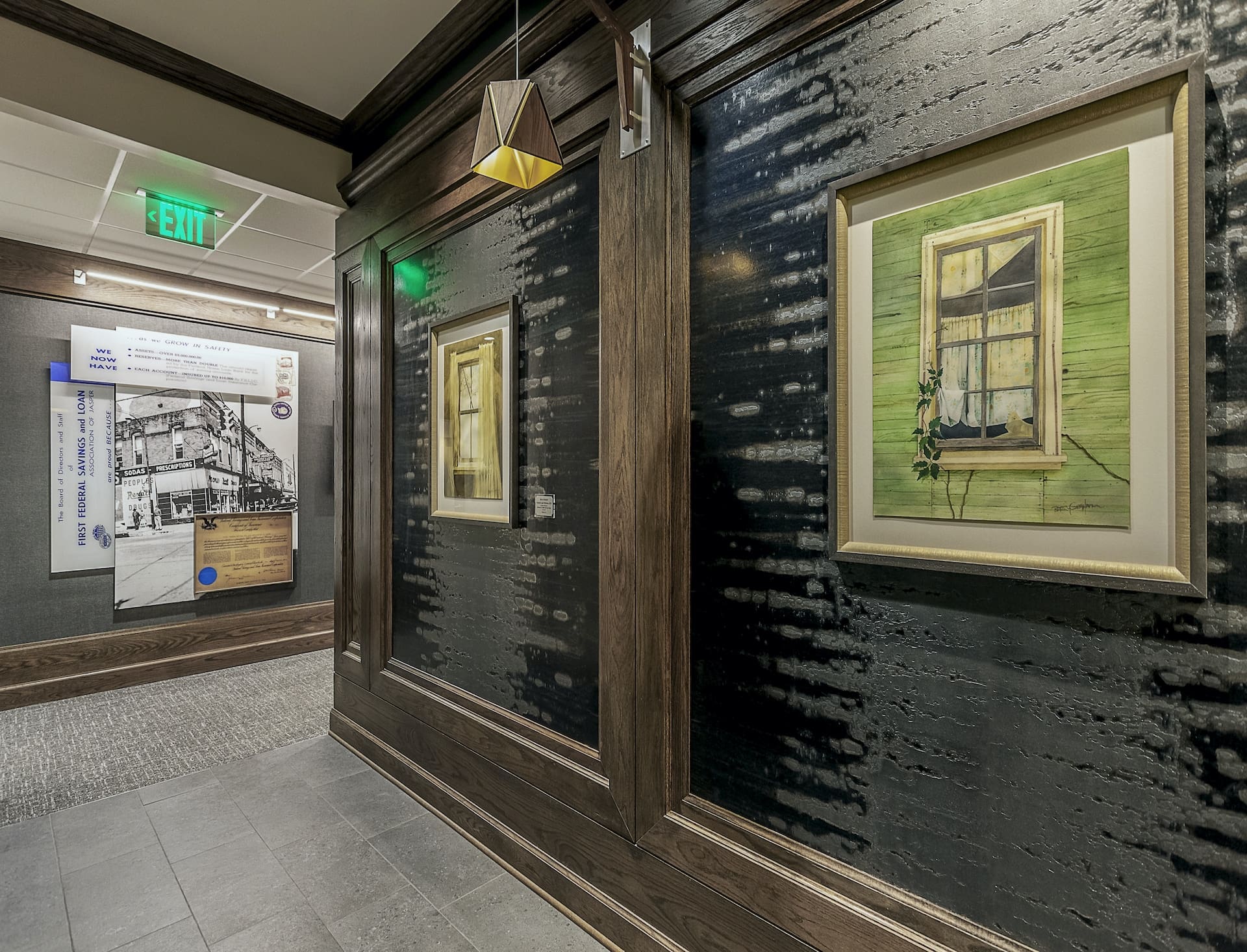
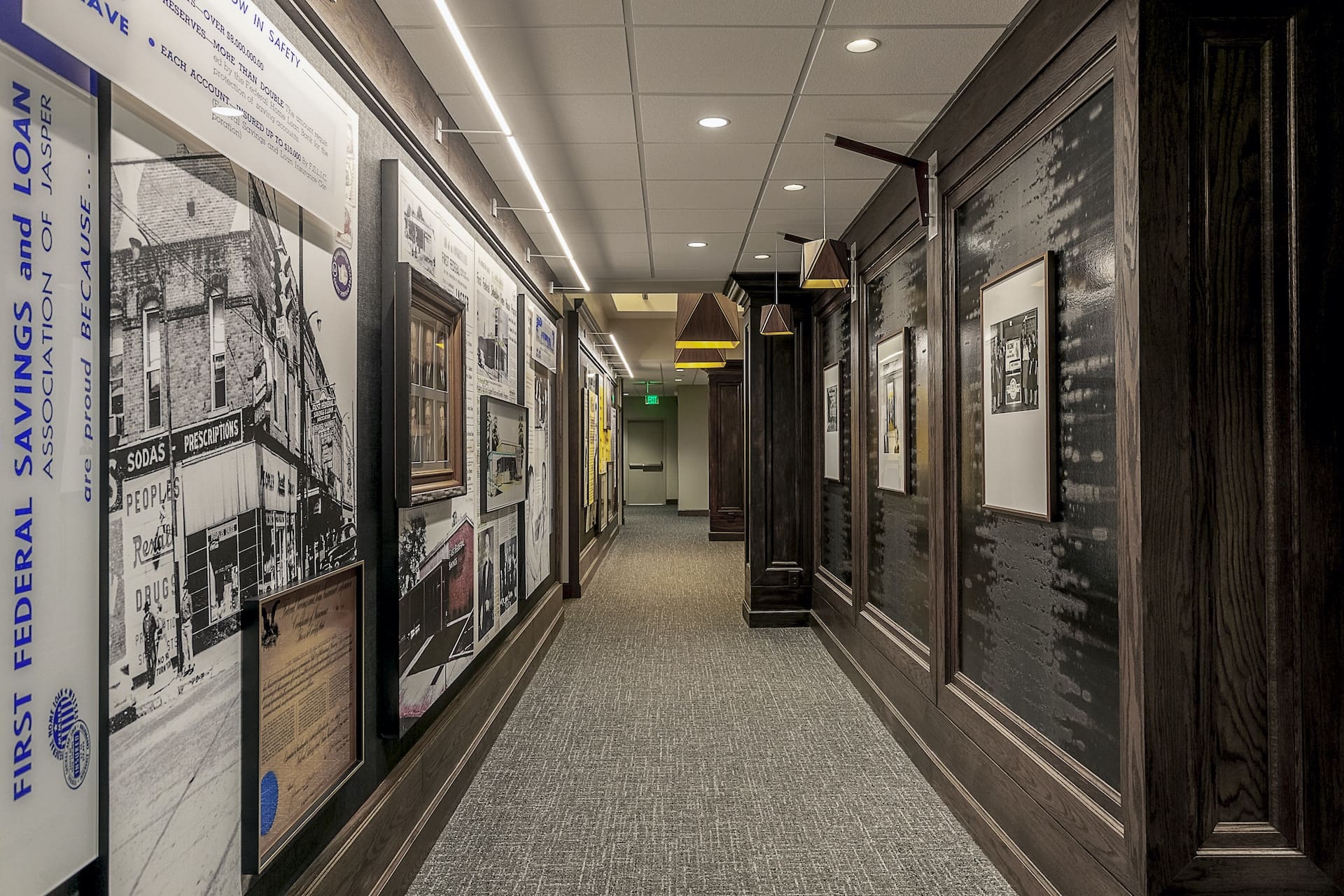
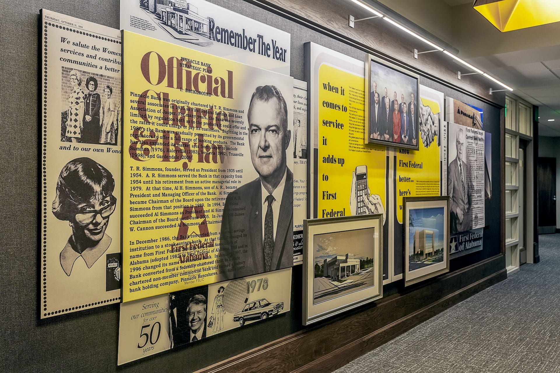
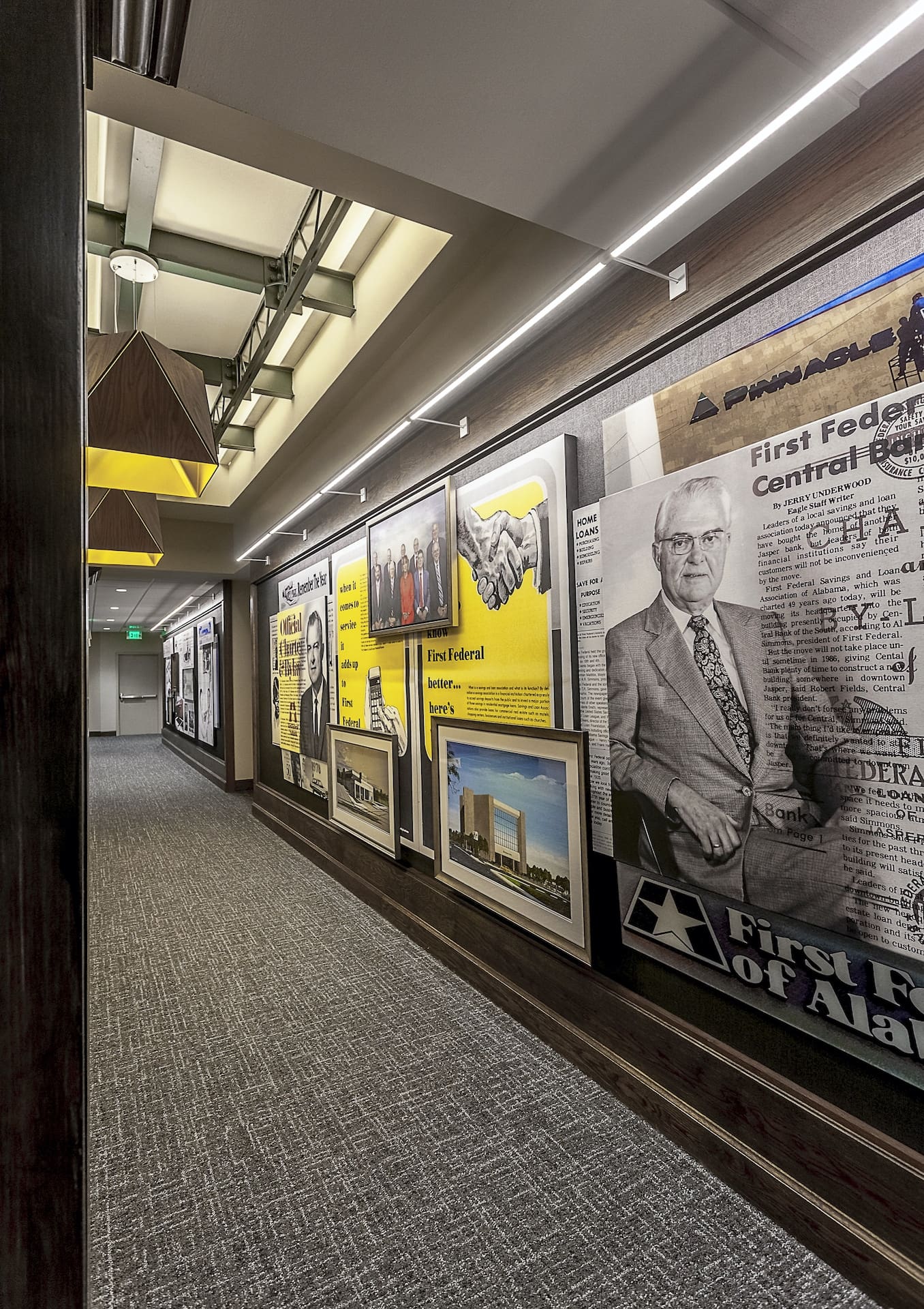
We used key existing elements, transforming and integrating them into the design to create interest and the “wow factor” they requested. The central corridor was designed to celebrate their history in “a walk through the history of the bank” from a drugstore building in the 1930’s to the 90’s when they became “Pinnacle” Bank. The design team worked closely with the client researching bank archives for the historical display along the corridor.
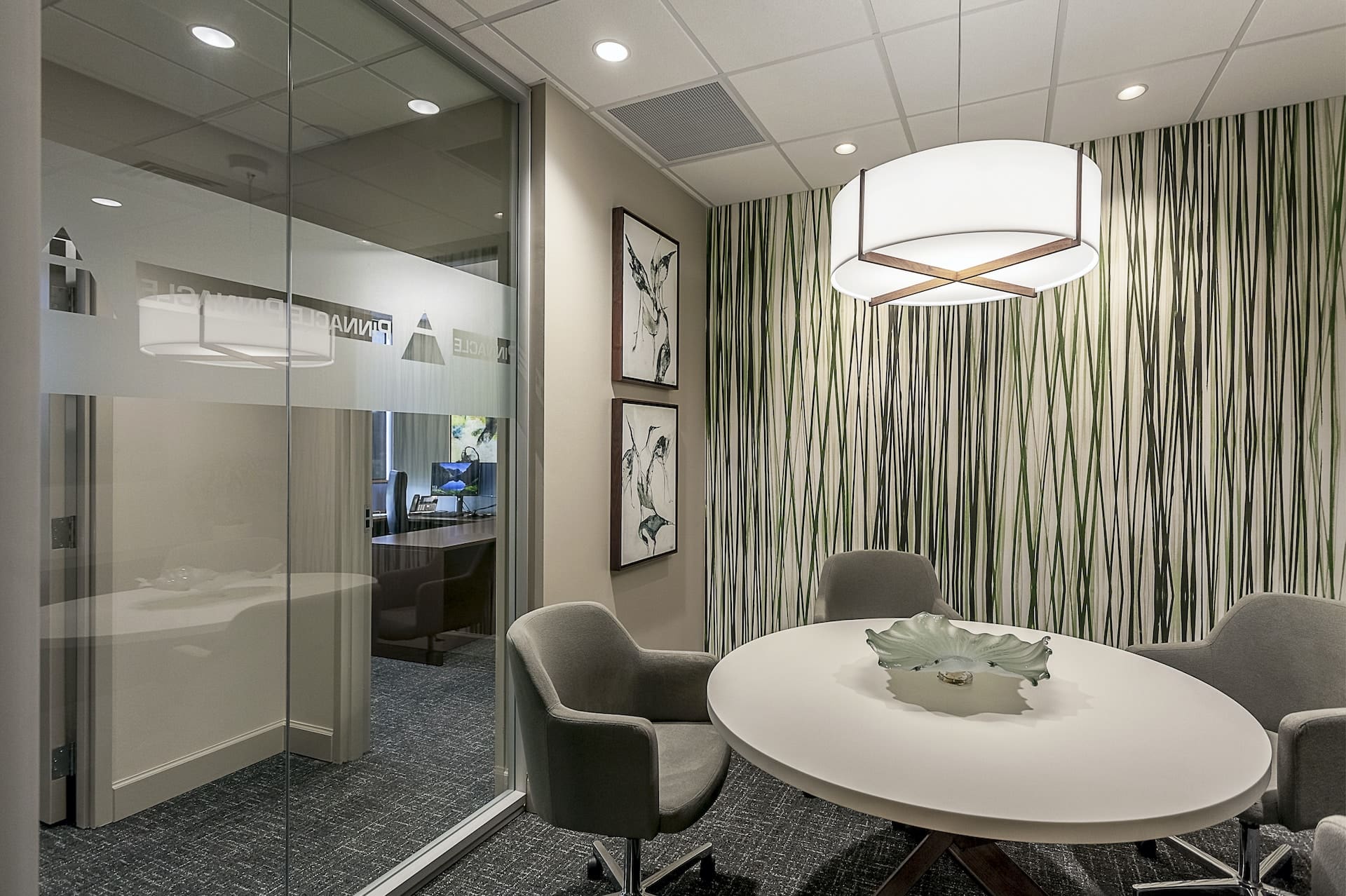
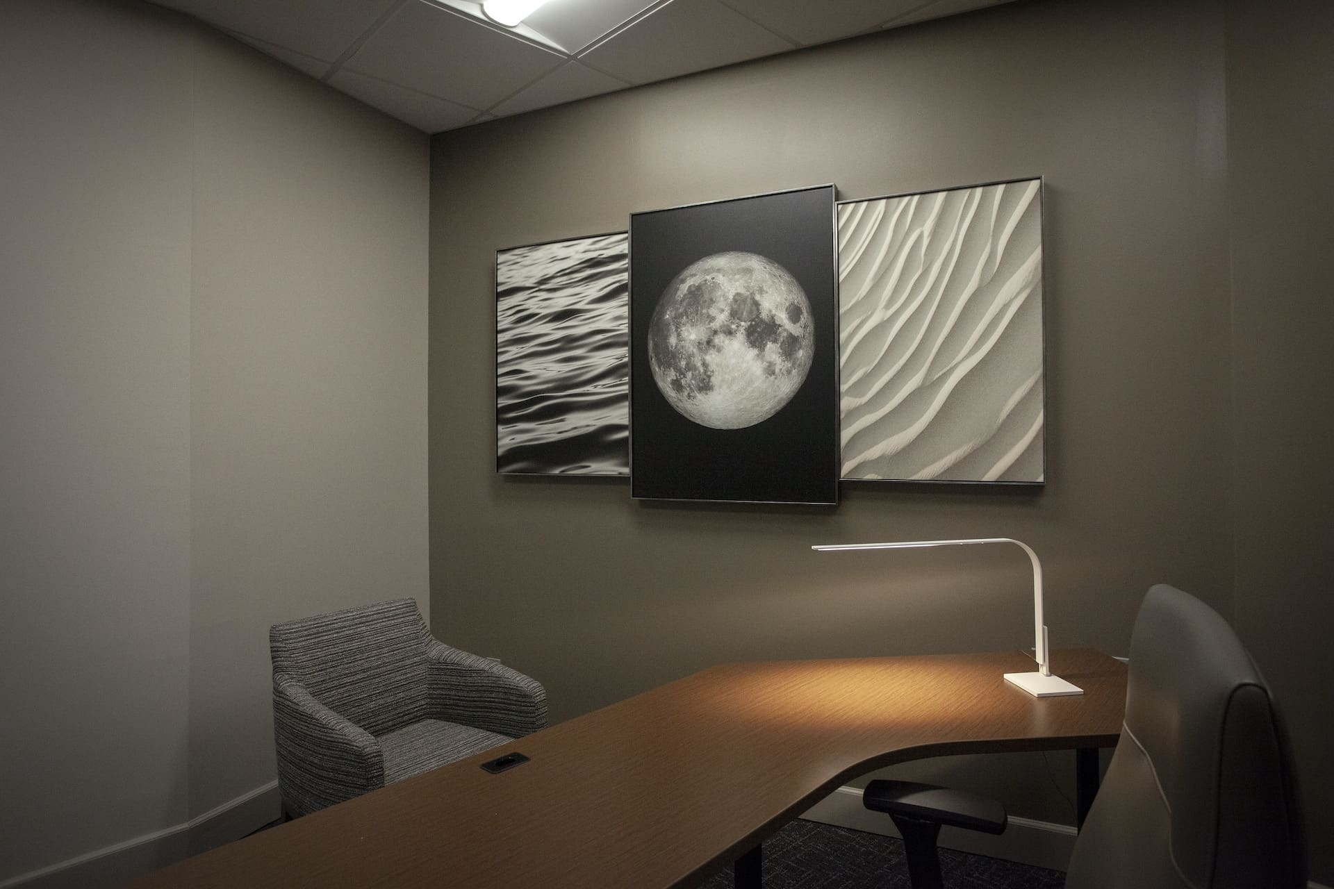
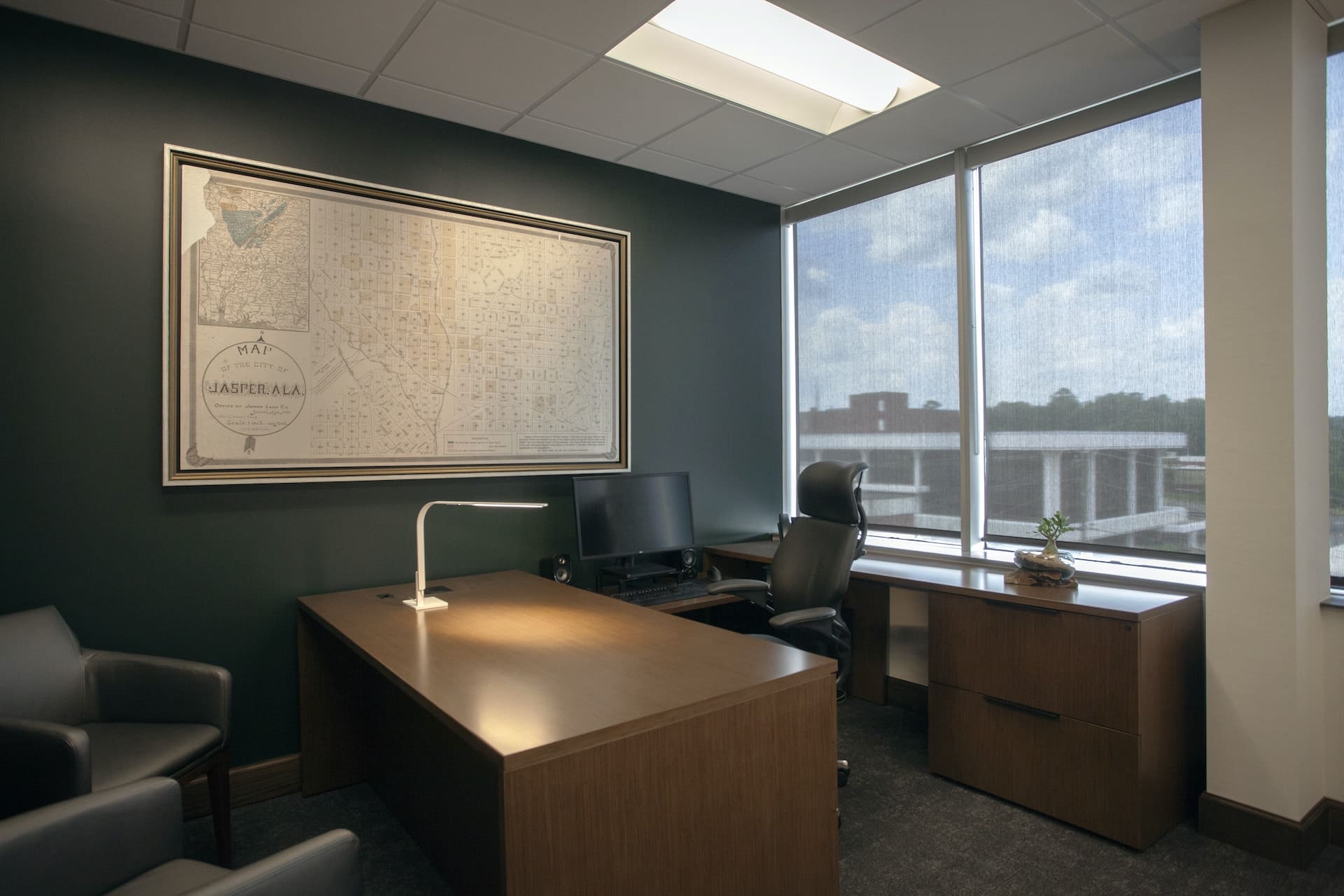
Our Design Goals included updating the interiors in a “transitional, not trendy” fashion, conveying a mature/stable character, while showcasing their 75-year history; providing privacy for the bank president and executives with new offices along the window walls; creating a “wow factor” for the elevator lobby and central corridor; and updating all lighting.
The existing facility was a sea of work cubicles, with single height lay-in ceilings, low bar joists, and dismal fluorescent lighting. To transform this space, conceptual planning included creative use of historical displays with commissioned art from local artists and contrasting finishes, while incorporating their “Pinnacle” logo and trademark green color as elements of the design. The execution of the project included gutting the space; developing the central corridor working around a structural column; integrating an abandoned skylight; modification of the president’s suite for increased privacy; and replacing cubicles with private offices.
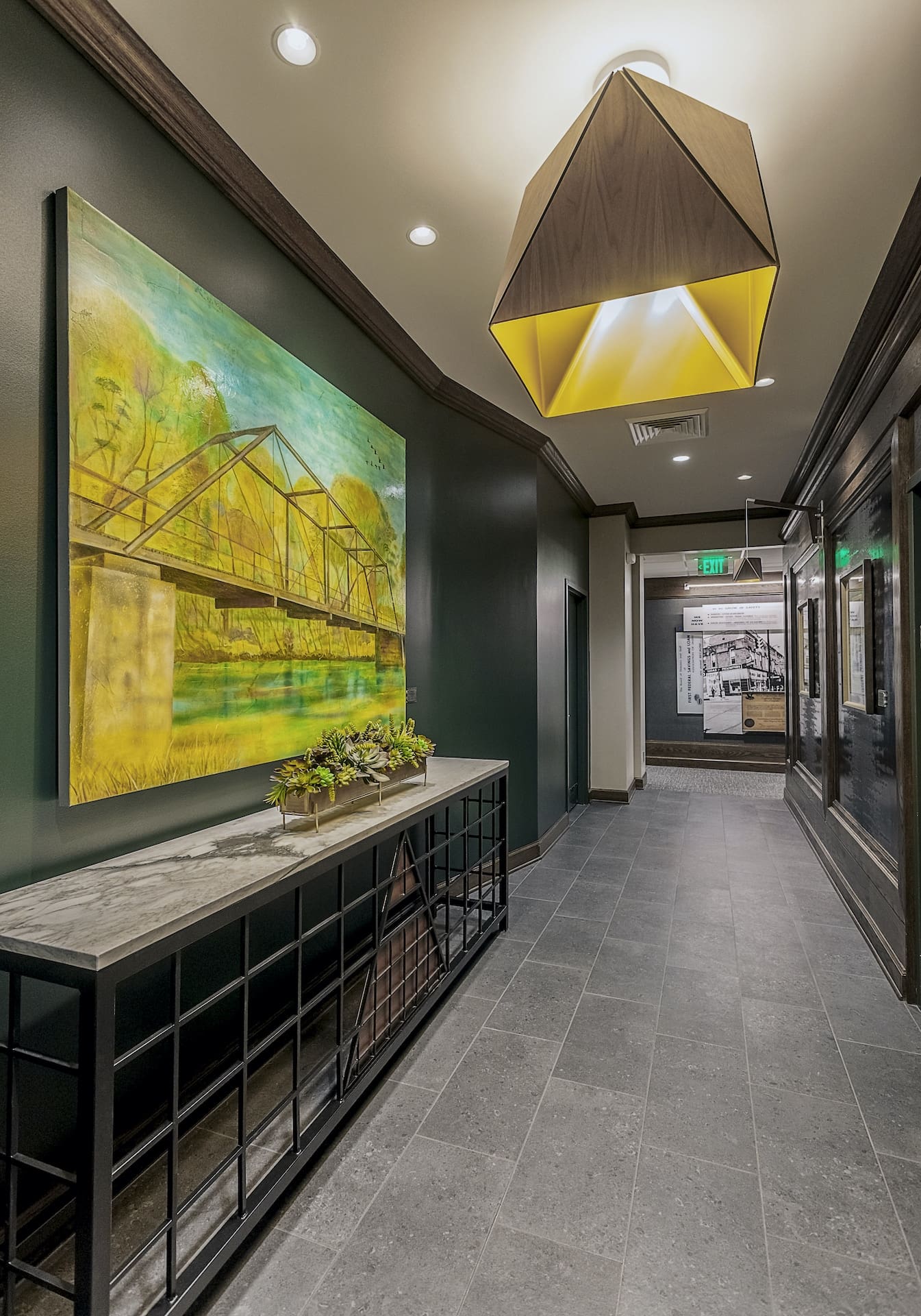
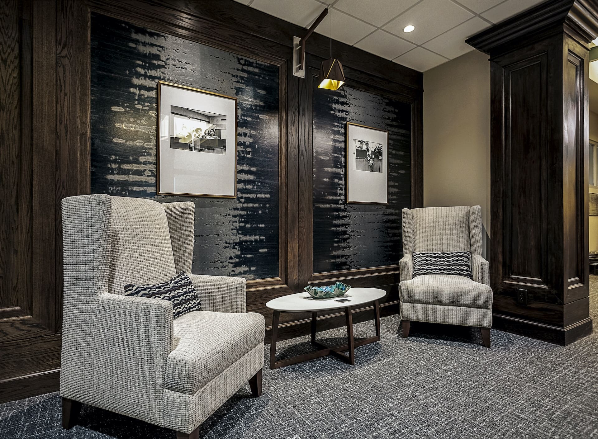
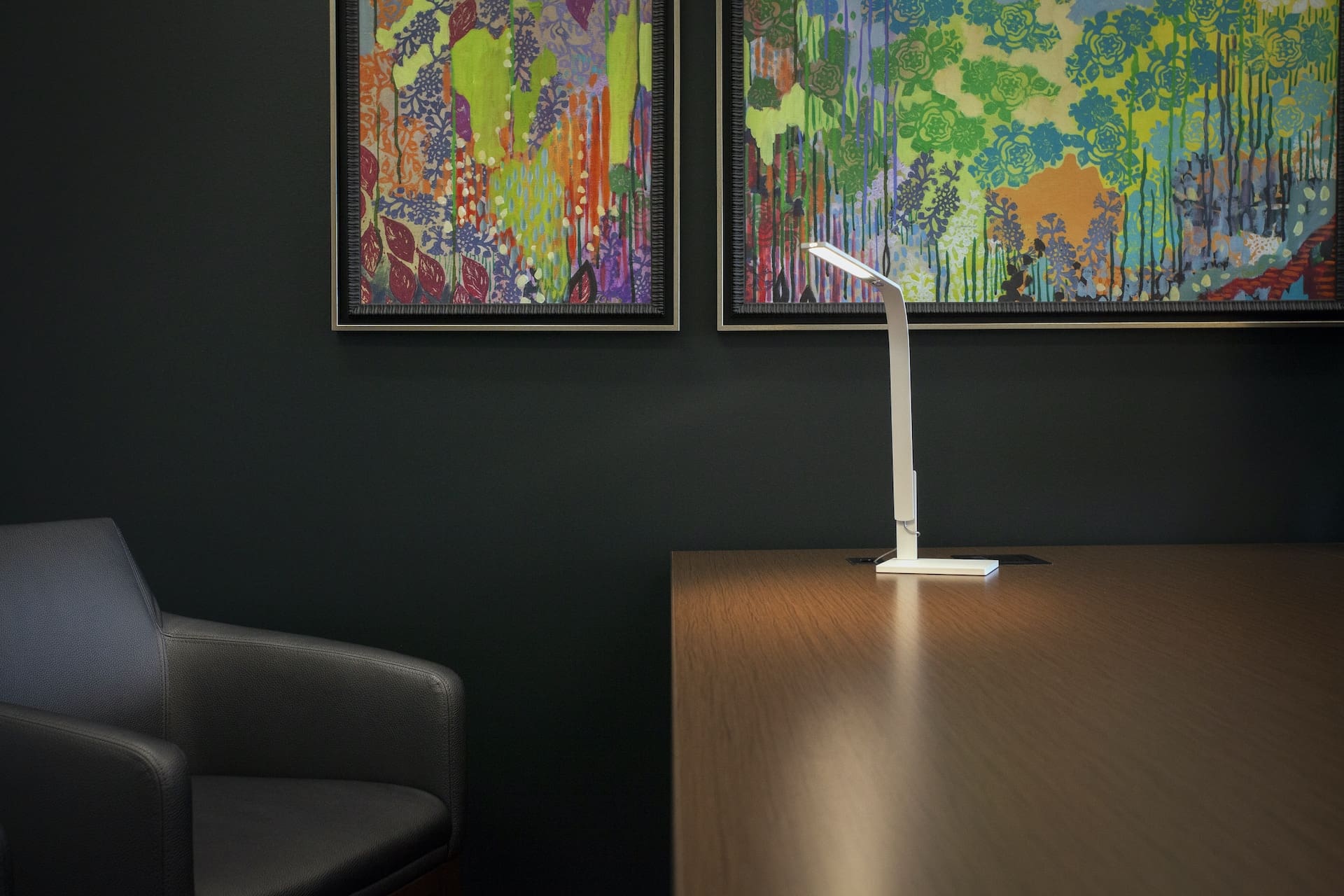
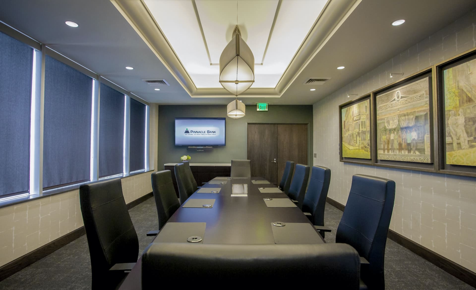
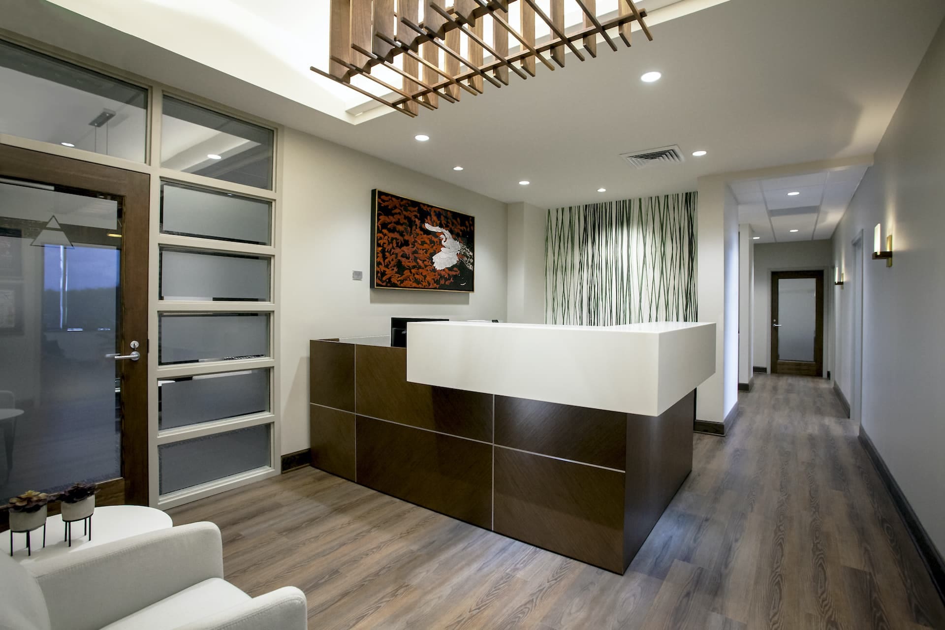
The abandoned skylight was one of the few opportunities for higher ceilings and was transformed into a unique design feature through strategic lighting around the exposed steel framework, painted “Pinnacle Green”. Corridor pendants and sconces repeated not only the rich stain of the paneling but also the triangular shape of the bank’s logo. The design of a custom elevator lobby console reinterpreted the bank’s original entry security gate. The structural column with paneling inspired the corridor design such that the detail was repeated along its length in a rhythmic pattern. We used a unique metal film wallcovering within the paneling as a dynamic backdrop to contrast the art and photography for visual impact. To reflect community interest and “we are here to stay” stability, we chose commissioned local art in various mediums. Small plaques by each piece identify the artist to visitors, as in a museum.
Construction cost per square foot was approximately $150.
